
Map #7: September 26, 2016
Difficulty Level: 5
Click here for a full-size version of this week’s map.
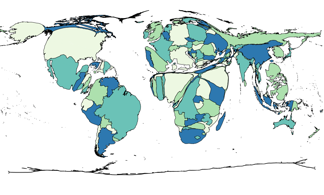
This map is a cartogram of the world. (Do you need a refresher on what a cartogram is? Visit our “Basics” page for a quick primer.) On this map, each country has been enlarged in proportion to a particular statistic. As has been the case with our previous two cartograms, the colors on the map are there only to help you distinguish one country from another. Your job for this week: figure out what statistic is represented by this cartogram.
Stumped? Check back Tuesday, Wednesday, Thursday, and Friday for hints about where to focus your investigation. The answer will be posted on Monday, October 3. Good luck!
Tuesday’s hint: When you look at a cartogram, it’s usually instructive to point out countries that are normally quite small in area that show up very large on the cartogram. This week, you can see that both Rwanda and Burundi stick out clearly on this cartogram. Perhaps a useful place to start would be to learn more about those two countries and who lives there.
Wednesday’s hint: Yesterday’s hint drew your attention to two countries in Africa, but the entire continent is actually fairly interesting. Many, but not all, of the countries in Africa are enlarged. The countries that appear the biggest are those in a rough band running from Côte d’Ivoire through Ethiopia, as well as pretty much every country south of that band. Let’s look at which countries in Africa are quite small: all of the countries in the Sahara Desert and along the Mediterranean Sea (though Egypt appears on this map more than other countries in North Africa), and countries farther down both the west and east coasts (Senegal, Gambia, Guinea, Djibouti, Somalia). What is something that those coastal countries have with desert countries such as Mali, Niger, and Chad?
Thursday’s hint: If you ignore, for the moment, the peculiar distortions of Africa and Asia on this cartogram, you will notice that the sizes of the countries on the continents of North America and South America track closely with their populations. The largest Western Hemisphere countries on this cartogram are the United States, Brazil, and Mexico, which are also the most populous. Canada, which is the second largest country in the world by area but which has a relatively small population, appears small on this cartogram. Colombia, which is the second most populous country in South America, is the second largest South American country on this cartogram—slightly larger than Argentina, which is the second largest South American country by area but only third in population. Therefore, your solution to this cartogram must be something that is essentially proportional to the total population for countries in the Western Hemisphere, but subject to more complicated factors in Africa and Asia.
Friday’s hint: The most useful hint we can give you is to tell you to look at the Philippines. More than any other country in Asia, the Philippines has been enlarged on this map. In fact, the Philippines is the fourth biggest country on this map, following only the United States, Brazil, and Mexico. The Philippines and East Timor are the only two countries in Asia where a majority of the population belongs to a certain category. If you can figure out what that category is, you’ll solve this map.
Answer: Click here to see an explanation of the answer to this week’s map question.
Next map: Click here to try out our newest map question.
