
Map #16: November 28, 2016
Difficulty Level: 6
Click here for a full-size version of this week’s map.
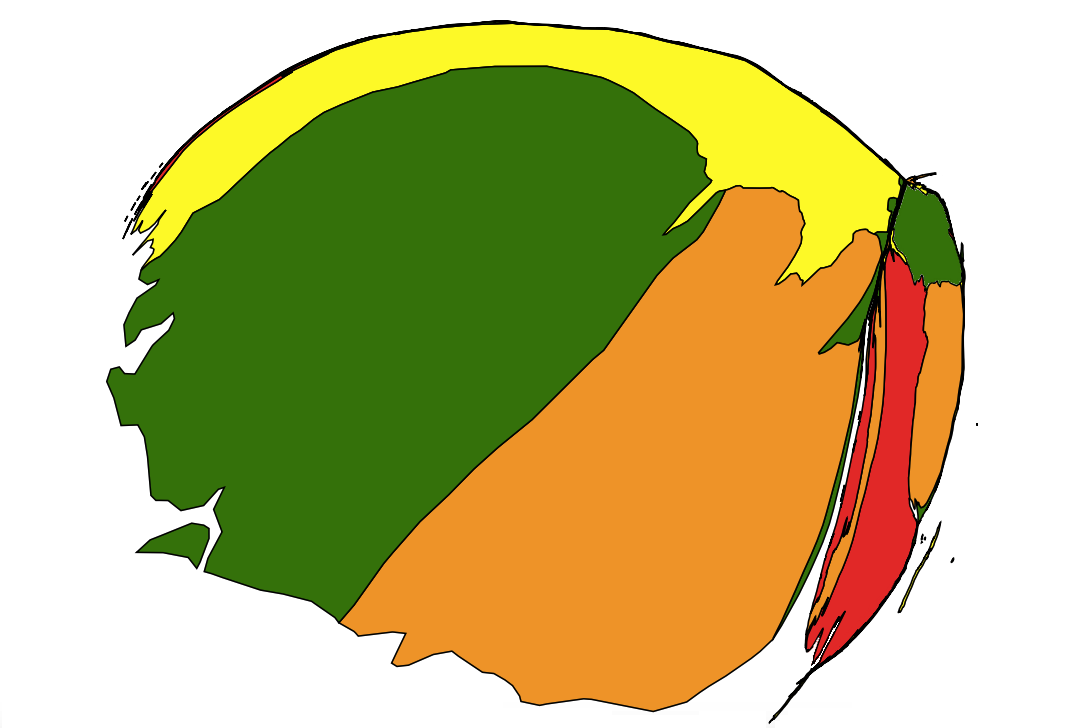
This map is a cartogram of the continent of Africa. (Do you need a refresher on what a cartogram is? Visit our “Basics” page for a quick primer.) On this cartogram, the size of each country is proportional to a particular statistic. As with our previous cartograms, the colors on this map are irrelevant; they are only there to help you distinguish one country from another. This cartogram is particularly distorted because there are many countries that are extremely small. One piece of advice: you will be better off if you focus on the countries that are large on this cartogram than on those that are small or nonexistent. Your job for this week: figure out what statistic is represented by this cartogram.
Stumped? Check back Tuesday, Wednesday, Thursday, and Friday for hints about where to focus your investigation. The answer will be posted on Monday, December 5. Good luck!
Tuesday’s hint: The first step toward solving this map is to figure out which country is which. One helpful resource may be this map, whose color scheme we have borrowed to make our cartogram. If a country is orange on that map, it’s orange on our cartogram. (One exception: on our map, South Sudan is green and Sudan is yellow) Does this help you figure out the countries?
Wednesday’s hint: Let’s look at the eastern part of this map. The large red country in the eastern part of this map is the Democratic Republic of the Congo. To its west (in orange) is the Republic of the Congo, and to the west of that (in red) is Gabon. On the other side, that orange country is Uganda; to its north (in green) is South Sudan. Just a few years ago, this cartogram would have consisted only of those five countries.
Thursday’s hint: Now, let’s look at the western part of this map. The three largest countries on this cartogram are all in the west: Guinea (yellow), Sierra Leone (green), and Liberia (orange). Sierra Leone is the largest country on this cartogram; it is about 32% larger than Liberia. There are also some other countries in West Africa that are just barely visible on this cartogram, though they’re much, much smaller. These include Nigeria, Mali, Côte d’Ivoire, and Senegal. Guinea, Sierra Leone, and Liberia were all in the news a lot from 2014 to 2016. Do you remember why?
Friday’s hint: It seems that yesterday’s hint was enough for most people to figure out this map, so the only thing to add today is to note that, when you’re looking for news from Guinea, Sierra Leone, and Liberia from 2014 through 2016, you might want to try searching specifically for news about health care.
Answer: Click here to see an explanation of the answer to this week’s map question.
Next map: Click here to try out our newest map question.
