
Map #18: December 12, 2016
Difficulty Level: 6
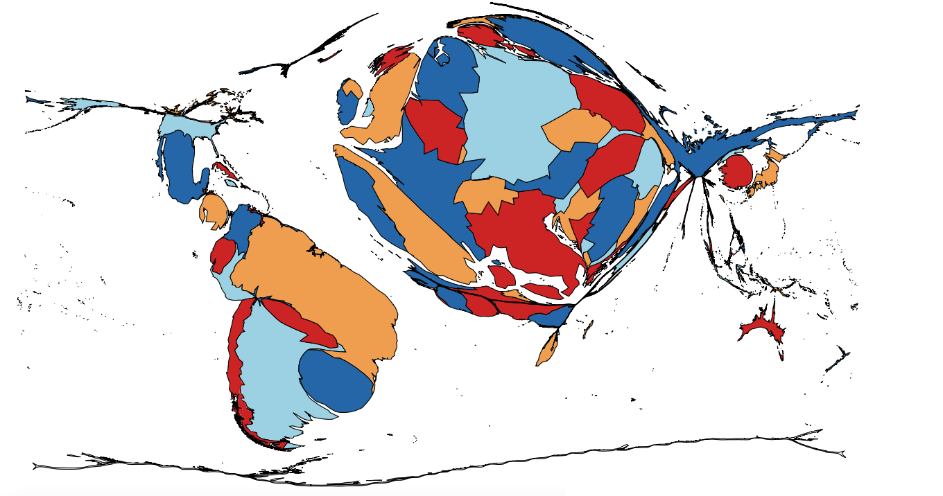
Click here for a full-size version of this week’s map.
This map is the second map in a five-week series. During this series, we will keep track of both the usual week-to-week scores and your cumulative score over the five-week period.
This map is a cartogram of the world. (Do you need a refresher on what a cartogram is? Visit our “Basics” page for a quick primer.) On this cartogram, the size of each country is proportional to a particular statistic. As with our previous cartograms, the colors on this map are mostly irrelevant; they are only there to help you distinguish one country from another. Be warned that, in a few places, our cartogram-making algorithm has incorrectly enlarged small countries that are surrounded by large countries (there is always some degree of error in making cartograms). One example of a country that is visible but shouldn’t be visible at all is Luxembourg, which had to be enlarged here because the three countries that border it are all quite big. Your job for this week: figure out what statistic is represented by this cartogram.
Stumped? Check back Tuesday, Wednesday, Thursday, and Friday for hints about where to focus your investigation. The answer will be posted on Monday, December 19. Good luck!
Tuesday’s hint: The first thing to notice about this cartogram is that many countries are completely absent—that is, they have an area of zero on the cartogram and, therefore, zero of this week’s mystery statistic. Among the countries which are entirely absent from this cartogram are China, Indonesia, New Zealand, Egypt, Togo, El Salvador, Honduras, Bolivia (see the note about Luxembourg above; it also applies to Bolivia), Canada, Israel, Iraq, Kuwait, and Haiti—just to name a few.
Wednesday’s hint: Since the overwhelming majority of countries in Africa do not appear on this cartogram, it is useful to look at those that do. It can be difficult to tell which country is which because the Sahara Desert is missing, meaning that we have countries along the Mediterranean and countries along the Gulf of Guinea that now basically border each other. Across the top, you can see Tunisia, Algeria, and Morocco. In West Africa, you can see Senegal, Côte d’Ivoire, Ghana, Nigeria, and Cameroon. Then, at the very bottom of the map, you can also see South Africa. The largest African country on this cartogram is Nigeria, which is 25% larger than Cameroon and Ghana. You also might be interested to know what this cartogram would have looked like had somebody made it, say, twenty-five years ago. On that map, Cameroon would be the largest African country; the only other visible African countries on it would be Morocco, Algeria, and Tunisia.
Thursday’s hint: On a previous cartogram, Map #5, we drew your attention to the fact that China and Taiwan were different colors. On this cartogram, again, we have been careful with the color scheme. In particular, each of the four constituent political units of the United Kingdom—England, Scotland, Wales, and Northern Ireland—has been depicted separately. The solution to this map involves something that these entities do separately.
Friday’s hint: One of the interesting features of this map is that Uruguay is so large. In fact, if you had made a similar map in the early 1930s, Uruguay would have been in a tie with Argentina for the largest country in the world. If you can figure out what was happening in Uruguay in 1930, you can probably figure out this map!
Answer: Click here to see an explanation of the answer to this week’s map question.
Next map: Click here to try out our newest map question.
