
Map #38: May 8, 2017
Difficulty Level: 8
Click here for a full-size version of this week’s map.
This map is the third map in a five-week series. During this series, we will keep track of both the usual week-to-week scores and your cumulative score over the five-week period.
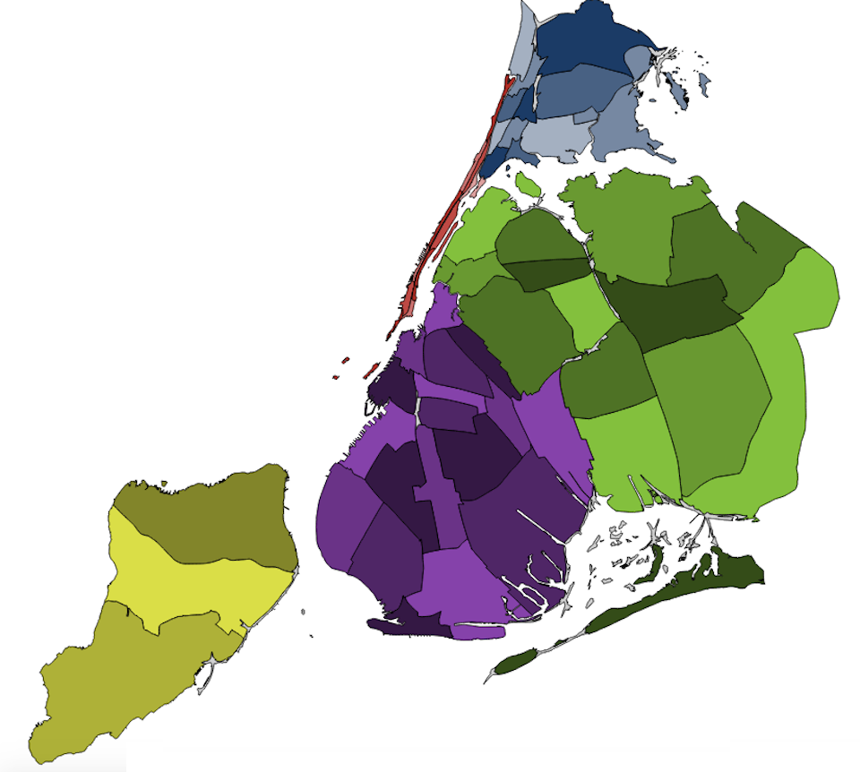
This map is a cartogram of a major world city. (Do you need a refresher on what a cartogram is? Visit our “Basics” page for a quick primer.) On this map, different sections of the city are enlarged in accordance with a particular statistic. As with our other cartograms, the colors on the map are just there to help you distinguish among the different parts of the map. For this map, we have used five different color schemes in order to help you focus on five different parts of the city. These color schemes will also help us point out interesting features of the map when we give hints later in the week. Note that the grey areas are uninhabited bits of the city such as parks; in some cases, they show up just because the populated areas on either side of them have been enlarged, but you are best off ignoring the parks entirely when you try to solve this cartogram. As always, your job is to figure out what this cartogram represents.
Stumped? Check back Tuesday, Wednesday, Thursday, and Friday for hints about where to focus your investigation. The answer will be posted on Monday, May 15. Good luck!
Tuesday’s hint: This city is presumably fairly recognizable as New York. The five different colors distinguish among the five boroughs: Manhattan is red, the Bronx is blue, Queens is green, Brooklyn is purple, and Staten Island is yellow. Queens is the largest borough on this cartogram. Brooklyn is about 63% the size of Queens, while Staten Island is about 42% the size of Queens. Manhattan is by far the smallest borough here—it’s only about 1.5% of the size of Queens. But in order to solve this cartogram, you’re going to have to look within boroughs at individual community districts. If you put this map side-by-side with Map #14a (a choropleth of New York’s community districts), then you can start to see which districts have been especially enlarged. Start by looking at Brooklyn: what pattern do you see?
Wednesday’s hint: On this cartogram, Brooklyn is especially helpful because it’s easy to discern a clear pattern from the shape of its community districts. The neighborhoods closest to Manhattan are generally quite small, while the neighborhoods farthest from Manhattan are fairly large. This same pattern also holds in Queens and the Bronx. This arrangement should tell you that you’re looking for something that is most pronounced in those parts of the city which are least densely populated.
Thursday’s hint: This week, one incorrect answer has been extremely common: lots of people have guessed that this map shows the total number of cars in each community district of New York. It’s an interesting and plausible guess. Manhattan is, in fact, the borough in which the lowest percentage of people own cars. Here’s the problem: the Upper West Side and the Upper East Side are both extremely populous areas that are quite wealthy, and the rates of car ownership there are not that low. So while Manhattan would appear relatively small on a cartogram of cars, it wouldn’t disappear to the same degree that it does on this week’s map. Rather, what you need to find is something that is even more implausible than a car to find in a densely populated area.
Friday’s hint: A good way to think about this week’s map is to imagine yourself standing on the streetcorner in some of the different community districts. You might even want to use Google Street View to investigate the different areas. If you look at Manhattan, you’ll see a forest of skyscrapers in every direction. But if you’re out on the edges of Staten Island or Queens, you’ll find hardly any tall buildings. Take a look through the backstreets of these parts of New York. Where do people in these areas live?
Answer: Click here to see an explanation of the answer to this week’s map question.
Next map: Click here to try out our newest map question.
