
Map #44: June 19, 2017
Difficulty Level: 5
Click here for a full-size version of this week’s map.
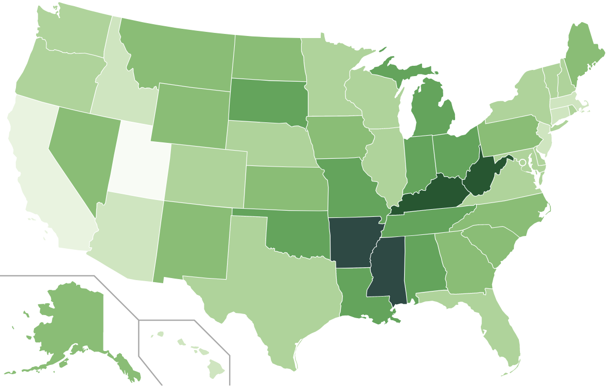
This map is a choropleth of the states of the United States. (Do you need a refresher on what a choropleth is? Visit our “Basics” page for a quick primer.) On this map, each state is colored in accordance with a particular statistic. Darker shades of green represent states with more of the statistic in question. In case it isn’t clear: Kentucky and West Virginia are in the darkest shade, then Arkansas and Mississippi are in the second darkest shade. Your job is to figure out what statistic is represented by this choropleth.
Stumped? Check back Tuesday, Wednesday, Thursday, and Friday for hints about where to focus your investigation. The answer will be posted on Monday, June 26. Good luck!
Tuesday’s hint: A few people have been misled by this map into submitting incorrect answers, so let’s go through two of them and see why they’re wrong. First, a few people have seen that Utah is very lightly colored and have guessed that this is a map of alcohol consumption rates. But that cannot be correct because the state with the highest alcohol consumption is New Hampshire. Second, a few people have seen that some states in the South are very dark and have guessed that it is a map of obesity rates. But that cannot be correct because the state with the lowest obesity rate is Colorado. So please take this hint as your weekly reminder to check your answers before submitting!
Wednesday’s hint: We pointed out yesterday that Utah has the lowest value for this week’s statistic. When Utah has an extreme value on a map, it tends to be related to the fact that Utah has a large Mormon population. On this week’s map, there is also a fairly low value in Idaho, the state with the second highest percentage of Mormons. What do you know about Mormon culture and beliefs that can help you make sense of this map?
Thursday’s hint: Sometimes, the data doesn’t turn out to be quite what would make giving hints easiest. In this case, it would be helpful if North Carolina were darker on our map! North Carolina grows the most, and Kentucky the second most, of a particular agricultural product. As a result, Kentucky is the darkest state on this map.
Friday’s hint: This link will take you to a handy tool for making choropleths of lots of different data sets about cancer. You can go through and make choropleths at either the state or country level for a variety of cancers. Take a look at the state-level choropleths of the incidences of the four most common types of cancer: breast, lung, colon, and prostate cancers. One of these four maps looks a fair bit like this week’s choropleth (though not exactly the same!). Which one? Why?
Answer: Click here to see an explanation of the answer to this week’s map question.
Next map: Click here to try out our newest map question.
