
Map #55: September 4, 2017
Difficulty Level: 8
Click here for a full-size version of this week’s map.
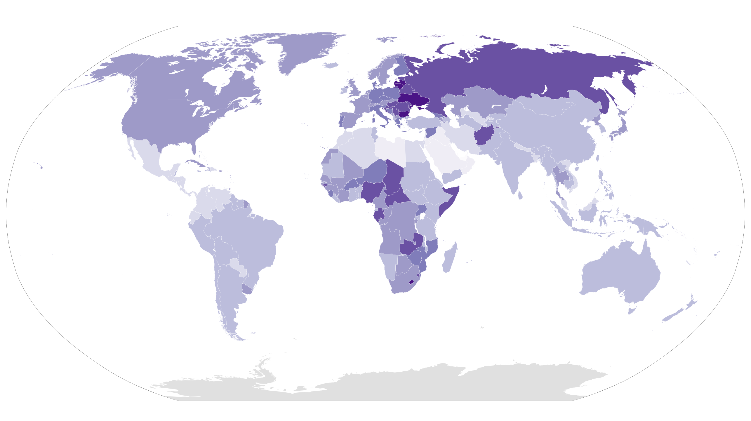
This map is a choropleth of the countries of the world. (Do you need a refresher on what a choropleth is? Visit our “Basics” page for a quick primer.) On this choropleth, each country is shaded in accordance with a particular statistic. Darker colors indicate higher values of the statistic in question. We have taken the data from a source that offers current values for every country and territory in the world, but many of those values are estimates. We have changed one of those values in accordance with a more recent academic study; it seems likely that other rigorous studies could determine slightly different values for a few particular countries where current statistics are especially unreliable. As always, your job is to figure out what this choropleth represents.
Stumped? Check back Tuesday, Wednesday, Thursday, and Friday for hints about where to focus your investigation. The answer will be posted on Monday, September 11. Good luck!
Tuesday’s hint: What is intriguing about this map is that the darkest countries generally fall into two categories: either they are post-communist countries of Eastern Europe or they are impoverished countries of sub-Saharan Africa. You may be wondering what these two very different regions have in common—and the answer is that they don’t have all that much in common at all. A more helpful way to look at this map is to consider this general trend: developed countries tend to be darker than developing countries, except in a few particular places. This trend certainly holds true in the Western Hemisphere, where the U.S. and Canada are darker than nearly every other country. This may turn out to be precisely the opposite pattern you would have expected.
Wednesday’s hint: One interesting feature of this map is that there are a few countries that stand out relative to their neighbors. In particular, take a look at Syria, Afghanistan, Somalia, and Yemen. These are all countries that are have something in common. They are not especially dark relative to, say, Eastern Europe, but you have to look at them in comparison to their neighbors. Why would Syria be darker than Jordan? Why would Yemen be darker than Oman?
Thursday’s hint: One of the darkest countries on this map is Lesotho. Lesotho also happens to be one of the countries with the highest prevalence of HIV—23.4% of adults in Lesotho are infected with that disease. Obviously, HIV alone cannot explain the pattern of this week’s map, but it does help explain why Lesotho and other sub-Saharan African countries are so dark.
Friday’s hint: The reason why most developed countries, and Eastern European countries in particular, are so dark on this choropleth is that their populations are generally quite old. In Germany, for example, nearly 27% of the population is over the age of 65. Compare that with somewhere like Niger, where only about 4% of the population is over 65. On this map, demographic trends like this tend to matter even more than war and disease.
Answer: Click here to see an explanation of the answer to this week’s map question.
Next map: Click here to try out our newest map question.
