
Map #60: October 9, 2017
Difficulty Level: 7
Click here for a full-size version of this week’s map.
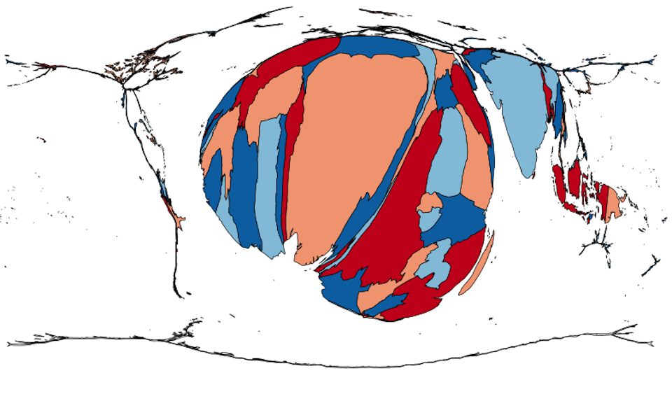
This map is a cartogram of the countries of the world. (Do you need a refresher on what a cartogram is? Visit our “Basics” page for a quick primer.) On this map, each country has been enlarged in proportion to a particular statistic. The data set we used to make this map consisted of estimates made by a major multinational organization. In other words, the data are as reliable as possible, but not 100% accurate. Moreover, you might find other estimates that are slightly different. Don’t worry; you should still be able to get the general impression from this map. As always, your job is to figure out what this cartogram represents.
Stumped? Check back Tuesday, Wednesday, Thursday, and Friday for hints about where to focus your investigation. The answer will be posted on Monday, October 16. Good luck!
Tuesday’s hint: The third largest country on this cartogram (after Nigeria and the Democratic Republic of the Congo) is India. India is often big on cartograms—after all, it has an enormous population. Something that involves just a small percentage of India’s population can nevertheless involve a huge number of people in absolute numbers. Many people who have submitted incorrect answers so far have focused on issues associated with poverty, such as childhood hunger. The problem is that one would expect India to be dramatically larger on such a map. In fact, you should think of India as being fairly small on this map. African countries such as Burundi, Malawi, or Benin are distorted much more than India is, even if India is larger overall. Your focus when you try to solve this map should mainly be on Africa. What might you find much, much more of in Africa than on other continents?
Wednesday’s hint: The continent of Africa is enlarged on this cartogram—but not the entire continent. The North African countries along the Mediterranean are barely represented. Neither is South Africa. Instead, the countries which are most visible are the tropical countries in the middle of the continent. Note also that Ethiopia, which is clearly represented on this map, is nonetheless a bit small. Neighboring Kenya, which is considerably smaller than Ethiopia in both area and population, is the larger of the two countries on this cartogram. You might note that these patterns have something to do with climate. The dry countries of North Africa are not well represented. Neither is South Africa, which is somewhat more temperate. And many parts of Ethiopia are not only quite dry but also very high in elevation. The countries that are largest on this cartogram are countries with humid, wet climates.
Thursday’s hint: The United States has zero area on this cartogram, meaning that it has none of the relevant statistic. If this cartogram had been made with data from before 1951, however, the U.S. might have had a small amount of area. In the late 1940s, a large amount of DDT was sprayed in parts of the southeastern U.S. DDT has now been banned worldwide because it devastates bird populations and probably causes cancer in humans—but it sure was effective at killing mosquitoes.
Friday’s hint: This cartogram depicts the estimated total number of cases in each country of a particular disease—what disease?
Answer: Click here to see an explanation of the answer to this week’s map question.
Next map: Click here to try out our newest map question.
