
Map #61: October 16, 2017
Difficulty Level: 6
Click here for a full-size version of this week’s map.
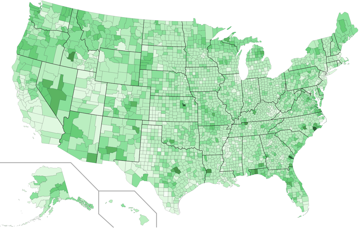
This map is a choropleth of the counties of the United States. (Do you need a refresher on what a choropleth is? Visit our “Basics” page for a quick primer.) On this map, each county is shaded in accordance with a particular statistic. For this map, it is worth reiterating the usual recommended strategy for solving our maps: first try to describe the overall trends, then research the places with extreme values and try to determine what makes them special. As always, your job is to figure out what this choropleth represents.
Stumped? Check back Tuesday, Wednesday, Thursday, and Friday for hints about where to focus your investigation. The answer will be posted on Monday, October 23. Good luck!
Tuesday’s warning: Note that every single county on this choropleth is colored in some shade of green. That means that each county has some measurable value for the statistic in question. If, after exploring some of the darkest counties on the map, you think you have figured out the solution, it would be wise to take a moment before submitting to ponder whether your idea makes sense for, say, a county in an extremely rural area with a population of only a few hundred people.
Tuesday’s hint: As reiterated above, a good strategy is often to look at general trends, then focus on extreme values. One general trend is that Western states are pretty dark. An exception is the state of Utah, which is lighter than its neighbors. When Utah stands out on a map, the reason usually has something to do with Utah’s large Mormon population. In this case, the pattern on this map is related—somewhat indirectly!—to the fact that many college-aged Mormon men spend two years on a church-sponsored mission.
Wednesday’s hint: Another general trend is that the counties that contain big cities tend to be lighter shades (this is true, for example, for the counties containing Houston, New York, Boston, Detroit, Chicago, Milwaukee, Minneapolis, and Seattle, among others). But there are a few major cities whose counties are actually darker than the surrounding areas. These include San Diego, Honolulu, and the whole region of southeastern Virginia, including Norfolk. (Remember that Virginia’s counties are weird—individual cities there have the status of counties) Can you think of something that San Diego, Honolulu, and Norfolk have in common?
Thursday’s hint: Let’s talk about some of the darkest counties. Let’s start by making a list: Onslow County, North Carolina; Cumberland County, North Carolina; Geary County, Kansas; Bell County, Texas; Coryell County, Texas; Island County, Washington; Kitsap County, Washington; and Chattahoochee County, Georgia. Look up a few of these counties and try to figure out what people do there. Pay specific attention to what the biggest employers in those counties are.
Friday’s hint: If you did as yesterday’s hint suggested and looked up some of those counties, you have likely discovered that those counties are all home to major military bases. Onslow County, North Carolina, for example, is the location of Camp Lejeune. Cumberland County, North Carolina, is the location of Fort Bragg. This week’s statistic is obviously closely related to the military. But note that it wouldn’t make sense to guess (as a great many of you have!) that this is a map of where soldiers on active duty are stationed. The U.S. does not have soldiers stationed in every single county. And it would be a very long commute from some remote outposts to the nearest base! So you have to ask yourself this question: in addition to soldiers on active duty, what other kind of person would you be particularly likely to find living in the vicinity of a large military base?
Answer: Click here to see an explanation of the answer to this week’s map question.
Next map: Click here to try out our newest map question.
