
Map #66: November 20, 2017
Difficulty Level: 2
Click here for a full-size version of this week’s map.
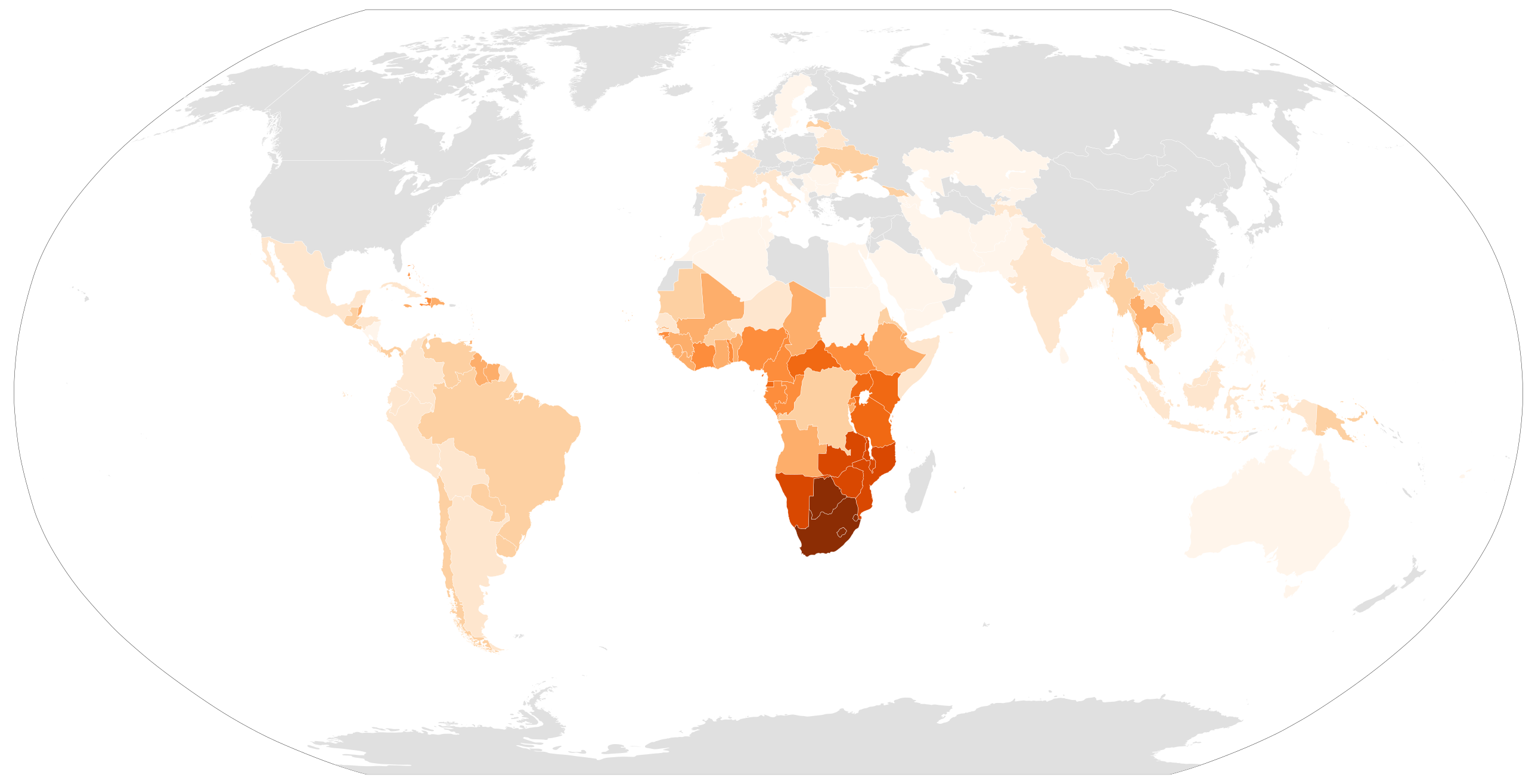
This map is a choropleth of the countries of the world. (Do you need a refresher on what a choropleth is? Visit our “Basics” page for a quick primer.) On this map, each country is shaded in accordance with a particular statistic; darker shades indicate higher values of the statistic in question. This map has an exaggerated scale, so the countries that have been shaded darkest have significantly higher values than other countries. We did not have available data for the countries shaded in grey, but in general it’s safe to assume they would all be shaded in the lightest color. As always, your job is to figure out what this choropleth represents.
Stumped? Check back Tuesday, Wednesday, Thursday, and Friday for hints about where to focus your investigation. The answer will be posted on Monday, November 27. Good luck!
Tuesday’s hint: You may have noticed that one of the darkest countries in the Western Hemisphere is Haiti. There’s a particular reason for that—and it’s very important. It has to do with the process of decolonization in Africa. When the country now known as the Democratic Republic of the Congo became independent from Belgium in 1960, it had a severe shortage of qualified doctors. Belgian authorities had not made an effort to educate the Congolese, and now Belgian doctors were returning to Europe. The United Nations stepped in to recruit trained doctors who spoke French to go work in the Congo. Most of the doctors who joined this initiative were Haitian. They worked for a while in the Congo, then returned to Haiti. And now, more than half a century later, Haiti is fairly dark on our choropleth.
Wednesday’s hint: In lieu of a more standard hint, let’s just continue the story we began in yesterday’s hint, which began to explain why Haiti appears especially dark compared with other countries in the Western Hemisphere. (Though please understand that the story in question is the subject of a great deal of conflicting research and intense academic debate) In the 1970s, one big industry in Haiti was the collection of blood plasma. Plasma is the liquid part of blood, and it’s important for medical care. Similar to donating blood, you can donate plasma. In fact, you can donate plasma much more often, since doing so doesn’t leave you quite so weak. In Haiti, where the majority of people were quite poor, an American company set up shop to pay people to donate plasma. It was a huge operation. It used modern machines that collected a patient’s blood, filtered out the plasma, and returned the blood to the body. And in order to collect as much plasma as possible, the tubing in the machines was used for multiple donors, one after another.
Thursday’s hint: The darkest countries on this map are all in the southern part of Africa: Swaziland, Lesotho, Botswana, and South Africa. Can you figure out what 27.2% of adults in Swaziland and 25.0% of adults in Lesotho have in common?
Friday’s hint: This week’s map has a lot in common with Map #60. Both maps depict data about diseases that are most prevalent on the continent of Africa. Whereas Map #60 was a map about a disease that is most widespread in central Africa, this map is about a disease that is most widespread in southern Africa. Additionally, you have to consider the different types of maps. Map #60 was a cartogram that showed the total number of people with a particular disease. What different questions can we answer by using a choropleth rather than a cartogram?
Answer: Click here to see an explanation of the answer to this week’s map question.
Next map: Click here to try out our newest map question.
