
Map #79: February 26, 2018
Difficulty Level: 4
Click here for a full-size version of this week’s map.
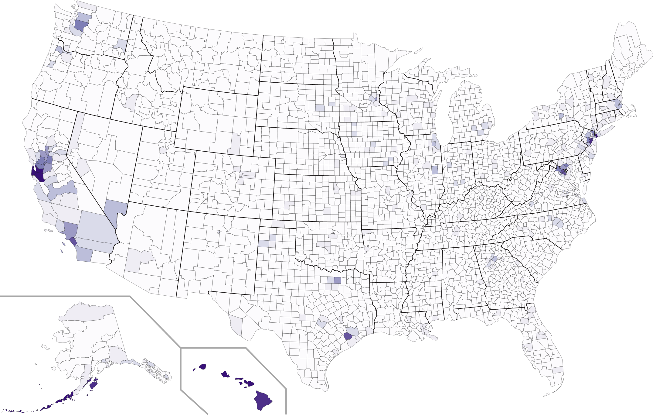
This map is a choropleth of the counties of the United States. (Do you need a refresher on what a choropleth is? Visit our “Basics” page for a quick primer.) On this map, each county is colored in accordance with a particular statistic. This map has a linear scale. As always, your job is to figure out what statistic is represented on this choropleth.
Stumped? Check back Tuesday, Wednesday, Thursday, and Friday for hints about where to focus your investigation. The answer will be posted on Monday, March 5, 2018. Good luck!
Tuesday’s hint: Although this choropleth is fairly sparsely colored, you can still discern some general trends. First, the map is darkest in the west and (generally speaking) gets lighter as you go east. Note that Alaska and Hawaii fit this overall trend. Second, urban areas tend to be darker than rural areas. Combining these two trends, you may want to think about what you know about urban areas of the West Coast, especially Honolulu, Seattle, San Francisco, and Los Angeles.
Wednesday’s hint: One of the darkest counties on this map is Orange County, California. Orange County is home to lots of cities, but among the most relevant for our purposes are two that aren’t that well known: Garden Grove and Westminster. What might you find if you went to one of those two cities?
Thursday’s hint: The Aleutian Islands of Alaska are also very dark on this map. In Aleutians East Borough (remember, Alaska doesn’t just have “counties” like most states), just over 22% of the population speaks Tagalog at home. In the Aleutians West Census Area, that number is closer to 14%.
Friday’s hint: This map is about the geographic distribution of race in the United States.
Answer: Click here to see an explanation of the answer to this week’s map question.
Next map: Click here to try out our newest map question.
