
Map #92: June 4, 2018
Difficulty Level: 5
Click here for a full-size version of this week’s map.
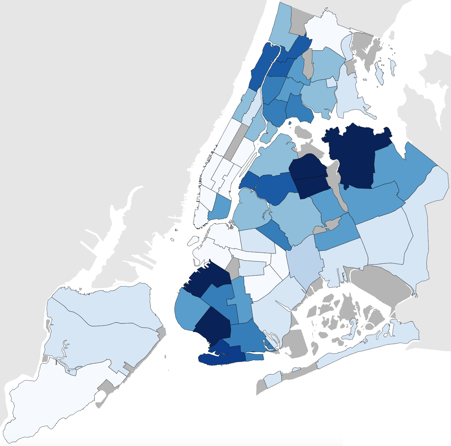
This map is a choropleth of the community districts of New York City. (Do you need a refresher on what a choropleth is? Visit our “Basics” page for a quick primer.) With this map, you should be sure to be careful about the wording of your answer; our intention is that the darker colors should indicate more of the statistic being mapped, but you could easily turn the statistic around say the lighter colors represent more of the opposite statistic. Just be careful and be precise! As always, your job is to figure out what this choropleth represents.
Stumped? Check back Wednesday, Friday, next Tuesday, and next Friday for hints about where to focus your investigation. The answer will be posted on Monday, June 25, 2018. Good luck!
Wednesday’s hint: This isn’t our first choropleth of the community districts of New York—so you might want to take a look at Map #14a. Imagine the inverse of that map, which would have some clear similarities to this week’s map. A good approach to solving this map would be to begin by making a list of the individual districts that would differ between this week’s map and the inverse of Map #14a.
Friday’s hint: Two districts that stand out when you compare Map #14a and Map #92 are Brooklyn 15 (which is relatively dark on both maps) and Bronx 12 (which is very light on both maps). If you can figure out why these two district deviate markedly from the general trend of Map #14a and Map #92 being inverted, then you will be very close to solving this map.
Tuesday’s hint: If you investigated the two districts mentioned in the previous hint, you may have discovered that one has a very large African-American population and the other a very large Russian population.
Friday’s hint: This week’s map has to do with language.
Answer: Click here to see an explanation of the answer to this week’s map question.
Next map: Click here to try out our newest map question.
