
Map #102: October 15, 2018
Difficulty Level: 6
Click here for a full-size version of this week’s map.
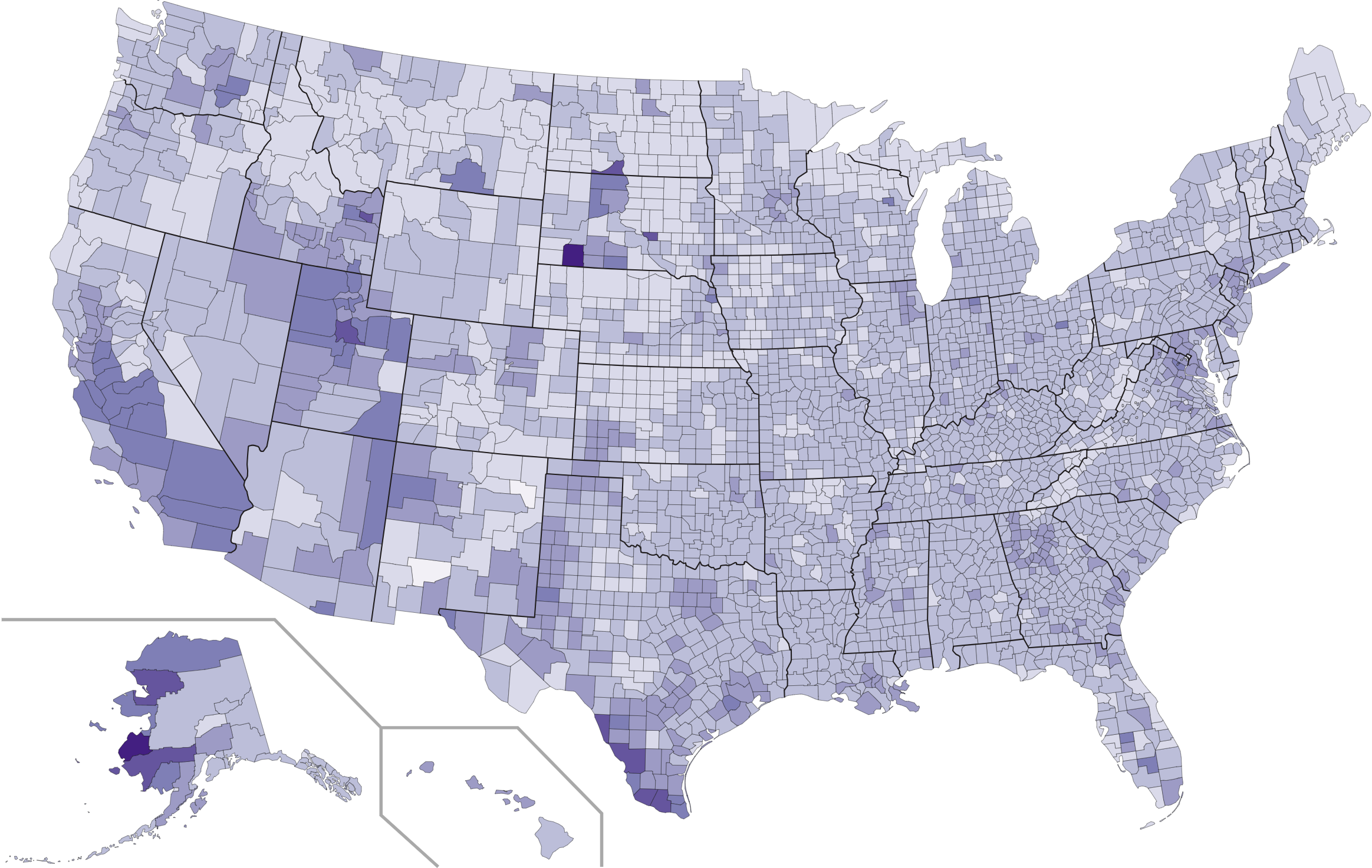
This map is a choropleth of the counties of the United States. (Do you need a refresher on what a choropleth is? Visit our “Basics” page for a quick primer.) Last week, we gave you a fairly easy county-level choropleth to get those of you who are new to the site into the swing of things. This week, we ramp up the difficulty. Hopefully, you will have begun to discover that certain counties are demographically interesting and worth exploring in greater detail. This week’s choropleth has a few things in common with last week’s—at least, there are a handful of counties that were quite dark on both maps. As always, your job is to figure out what this choropleth represents.
Stumped? Check back Tuesday, Wednesday, Thursday, and Friday for hints about where to focus your investigation. The answer will be posted on Monday, October 22, 2018. Good luck!
Tuesday’s hint: Don’t neglect the smallest counties just because they’re hard to see! On this map, the lighest possible color is used for only five counties, and two of them are fairly notable ones. One is America’s least populous county, Kalawao County, Hawaii. Another is America’s most densely populated county, New York County, New York (that is to say, the island of Manhattan). Obviously, those two counties have very little in common with one another. In fact, being lightly colored on this map may be the only thing they have in common!
Wednesday’s hint: One interesting pattern on this map is that densely populated cities seem to be more lightly colored than the suburbs that surround them. This pattern is true, to some degree, for Chicago, Atlanta, New York, San Francisco, Cleveland, Charlotte, Boston, Nashville, Minneapolis–St. Paul, and Washington. So you might want to think about some of the differences between urban and suburban areas. Under what circumstances might somebody move from one to the other?
Thursday’s hint: The most important clue to solving this map is probably to look at how darkly colored Utah is. That’s because Utah has a large Mormon population. What do you know about family life in Mormon communities?
Friday’s hint: This week, quite a lot of people have guessed that the map has to do with fertility rate. That’s very much on the right track, and those people were correct to identify that people in areas with large Latino, Native American, and Mormon populations on average tend to have more children. But the answer doesn’t quite work overall. Fertility rate only applies to women in their childbearing years, so it’s hard to know what to make of it in counties with aging populations, such as Sumter County, Florida. Instead, you need to find a different measure that more accurately accounts for this map.
Answer: Click here to see an explanation of the answer to this week’s map question.
Next map: Click here to try out our newest map question.
