
Answer to Map #102
Click here for a full-size version of this week’s map.
Back to this week’s maps and hints.
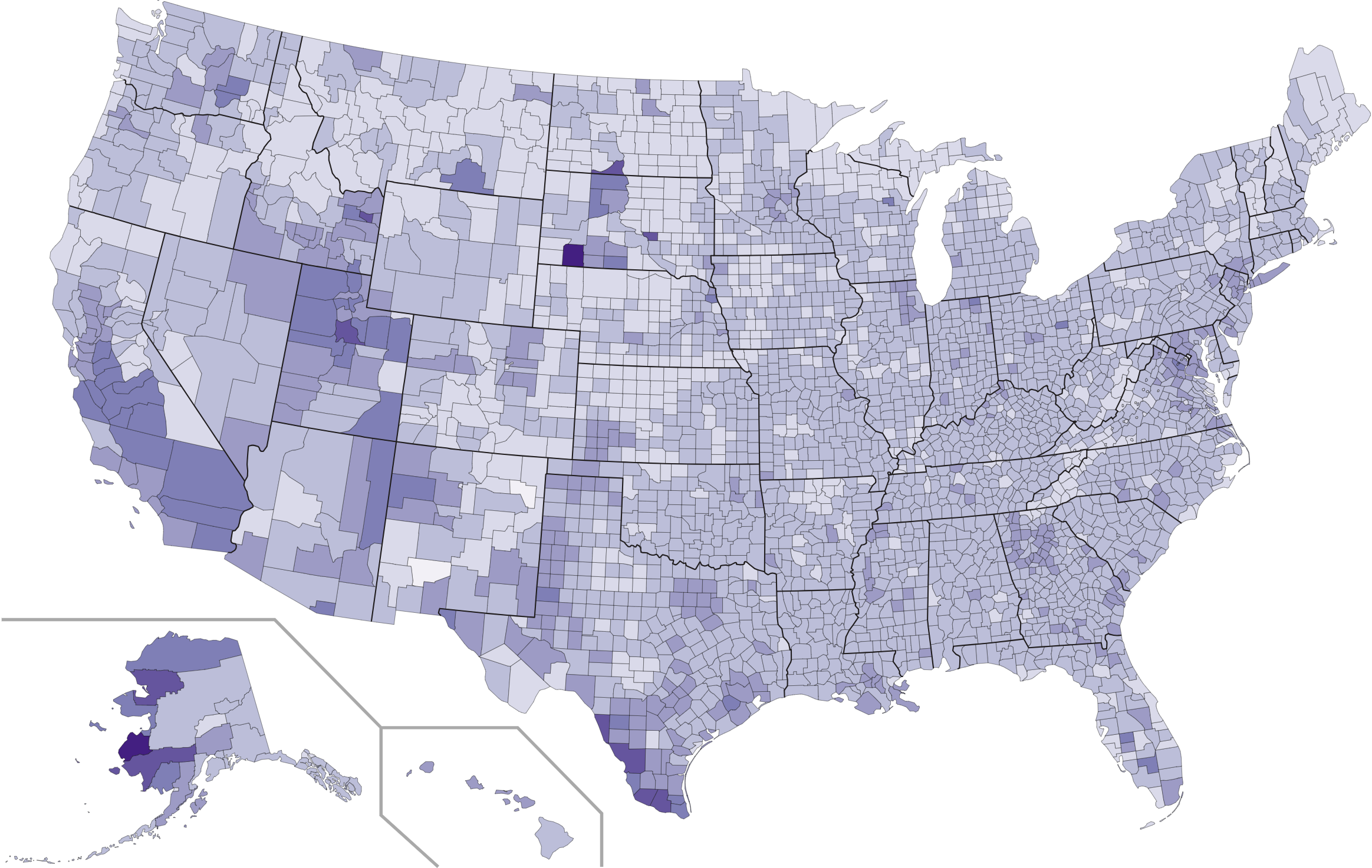
Answer: This week’s choropleth depicted the average household size in each U.S. county as of the 2010 census.
A fair number of people guessed that the map had to do with birth rate, and after some investigation we ended up deciding that that answer had to be accepted as well. With the scale this map had, it’s hard to distinguish effectively among a few different answers. Broadly speaking, counties with younger populations that have more kids have both a higher birth rate and a higher average household size. A county that has an older population will have smaller average household sizes because fewer children live at home, and those counties will also have lower birth rates because the population is older. So we gave credit for both answers.
But the actual data being mapped here has to do with average household size. On the 2010 census, respondents were asked how many people lived in their households. The possible choices were 1, 2, 3, 4, 5, 6, or “7 or more.” All the people with 8- or 9-person households are undercounted a little bit, but in general the numbers should be pretty close.
The counties with the smallest average household size come in two varieties. First, there are those with very old populations, such as Sumter County, Florida, and Kalawao County, Hawaii. Second, there are urban counties where many young people live on their own, such as New York County, New York.
The counties with the highest average household size tend to be counties with large Latino, Mormon, or Native American populations. All of these groups tend to have large families.
One interesting trend that is visible on this map is the difference between major cities and their suburbs. The people most likely to live in the center of urban areas are those who are willing to tolerate less space—that is to say, young people without children. As people get older and have kids, they move out to the suburbs. Such a trend produces visible differences in most urban areas around the country.
Next map: Click here to try out our newest map question.
